User Experience & Visual Design
Multi-site Conference Project
My Role
UX & Visual Designer
Team
UX & Visual Designer
Client/Stakeholders
Project Manager
Developer
Deliverables
UX Discovery & Research
Wireframes
Visual Design
Duration
6 months
About
ISPE tasked us with redesigning their conference website to enhance user engagement, streamline registration, and effectively showcase sponsors and event details. I collaborated with their internal team and North Studio developers to deliver a user-centered design that maintained ISPE’s global brand consistency while creating a distinct identity for the conference.
Key Objectives:
- Improve user flow for conference attendees, from site entry to registration.
- Integrate third-party systems like IMIS for agendas, sponsor headshots, and more.
- Align conference branding with ISPE’s overall identity while giving it a unique look.
- Ensure the site met accessibility and usability standards.
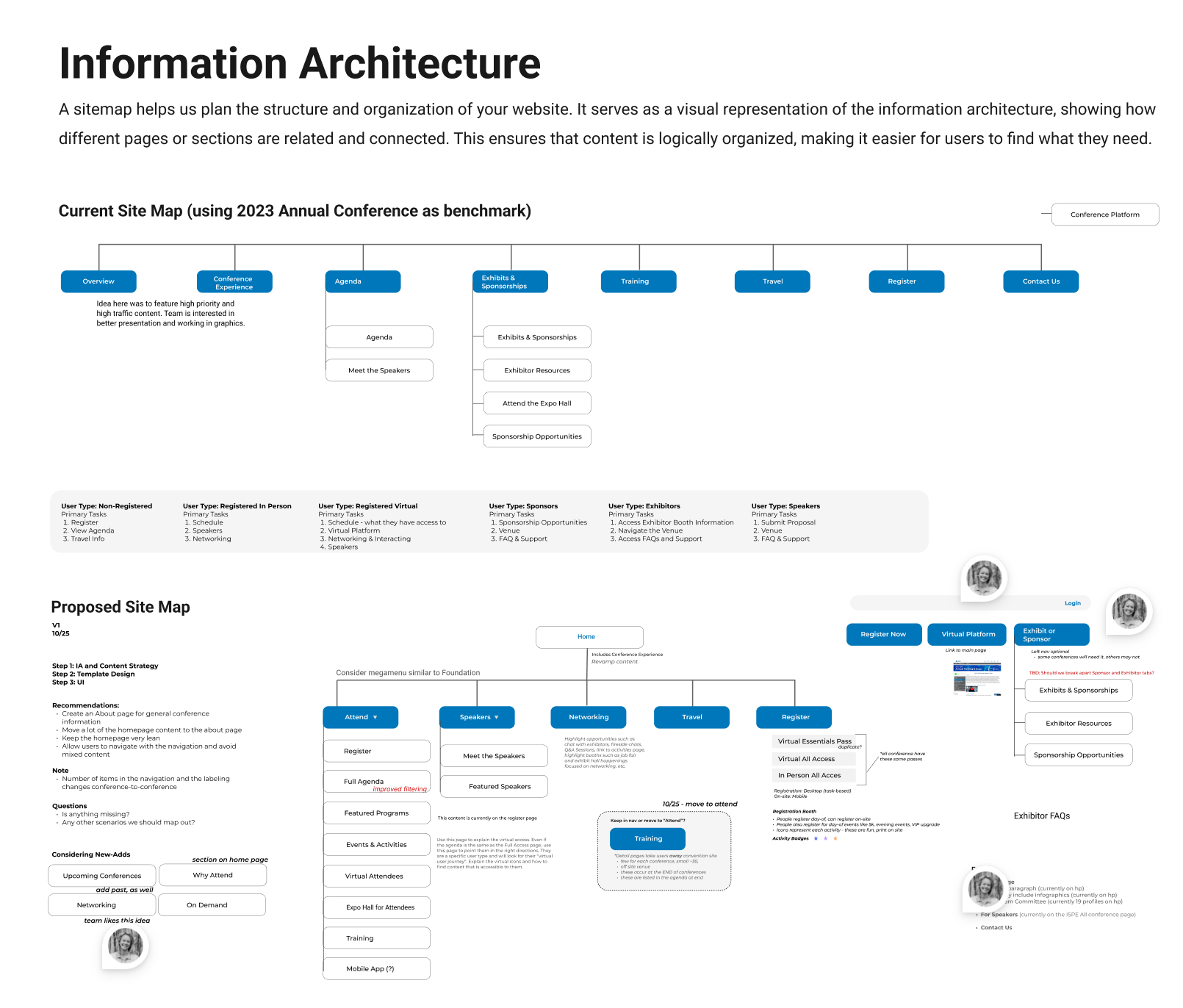
1. UX Discovery Audit
I began with a UX audit, evaluating the existing conference section, target audiences, and goals. This included:
- User Journey Analysis: I identified roadblocks and opportunities to improve the user flow for tasks like registration and program exploration.
- Competitive Analysis: I examined competitor websites to uncover industry best practices.
- Conversion Funnel Review: Analytics helped us pinpoint drop-off areas and suggest improvements to increase conference attendance.
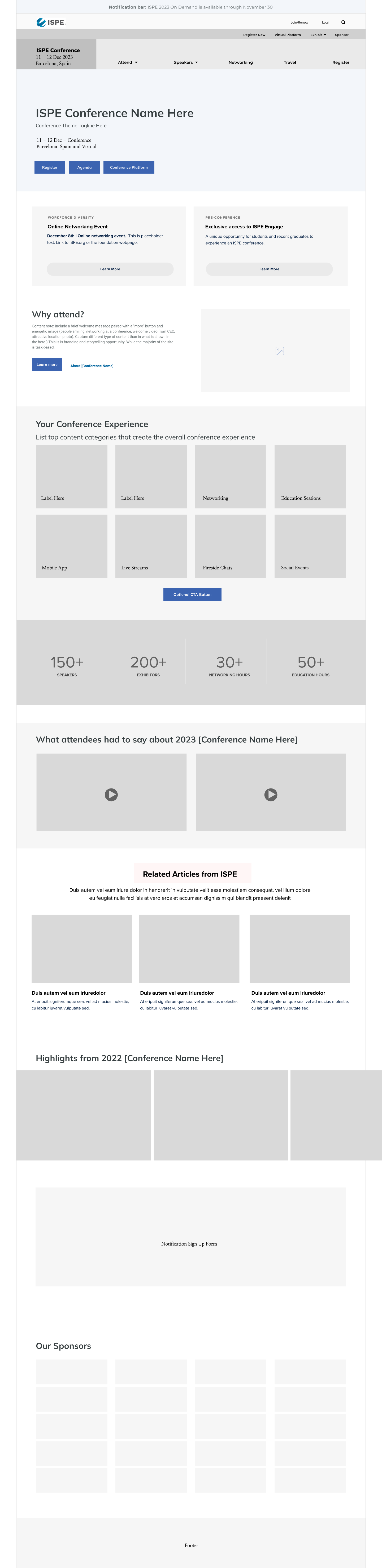
2. Wireframing & UX Design
I created wireframes to structure key conference pages, such as the homepage and agenda. These wireframes allowed us to focus on functionality and usability before adding design elements. After collaborating with ISPE’s team, I refined the layouts based on their feedback to ensure the designs met both user and business needs.
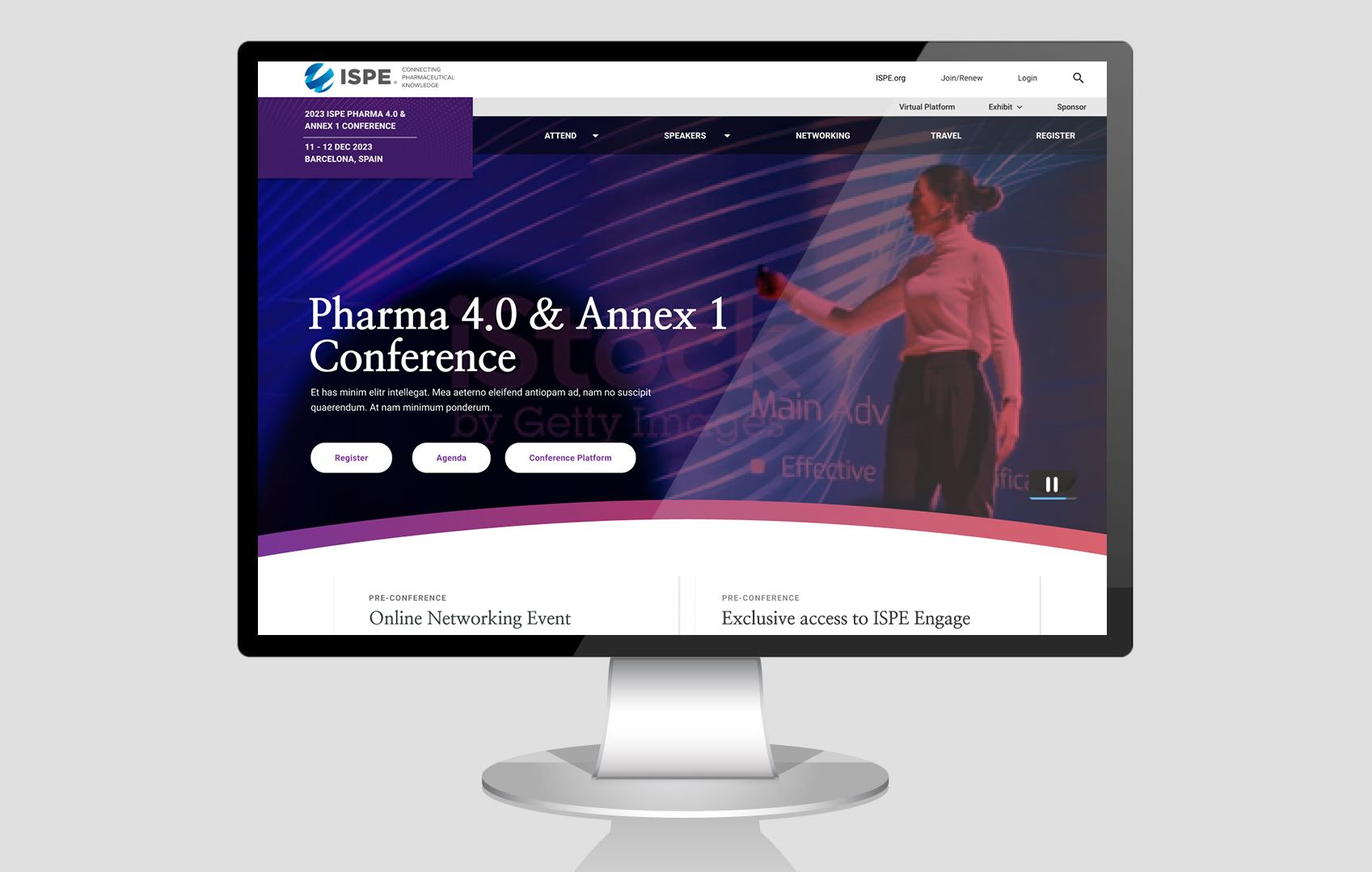
3. Conference Branding
Next, I explored how the conference branding fit within ISPE’s larger visual identity. I considered:
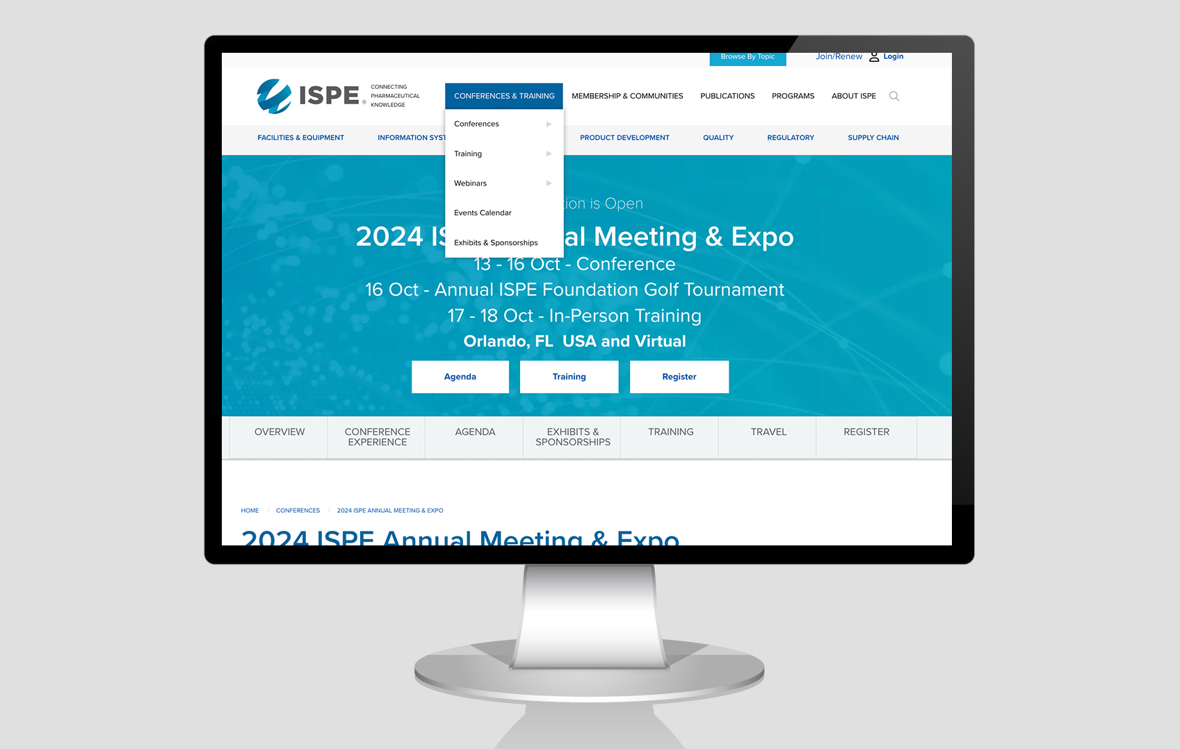
- Global Branding Integration: Incorporating ISPE’s global header and brand elements to maintain consistency.
- Unique Conference Branding: Developing a distinct visual identity for the conference, using customized colors, imagery, and messaging for a fresh look while staying true to ISPE’s brand.
4. Visual Design & Testing
Once the branding was determined, I applied ISPE’s updated UI components to the conference site. This ensured a cohesive, visually engaging experience. I also tested an interactive prototype, validating design decisions through real user feedback and making final adjustments before development.
Results:
The redesigned ISPE conference website improved the user experience, leading to higher registration rates and greater engagement from sponsors. The integration of third-party systems, a streamlined registration flow, and unique branding created an immersive and seamless experience for attendees. The feedback from ISPE’s internal team and users was overwhelmingly positive, setting a new standard for future events.