MailingList Branding & Redesign
Branding & Website Redesign
Branding & Website Redesign
The business had grown in various directions over the years. As a result, there were a myriad of brands in one space. I was able to help the client unify the brands and define a single brand to represent the current business.
Live site: mailinglists.com (new window)
Background
Similar to Dun & Bradstreet, this client's product represents a public data source. That includes compiled data, response data, circulation data, as well as public record data and catalog type lists. They sell databases based on a variety of criteria to meet client's needs. They have a search that allows users to find NAICS and DUNs codes. There is an API paired with this that is shared to other similar companies. These other companies are selling the data to individuals and businesses.
Challenge
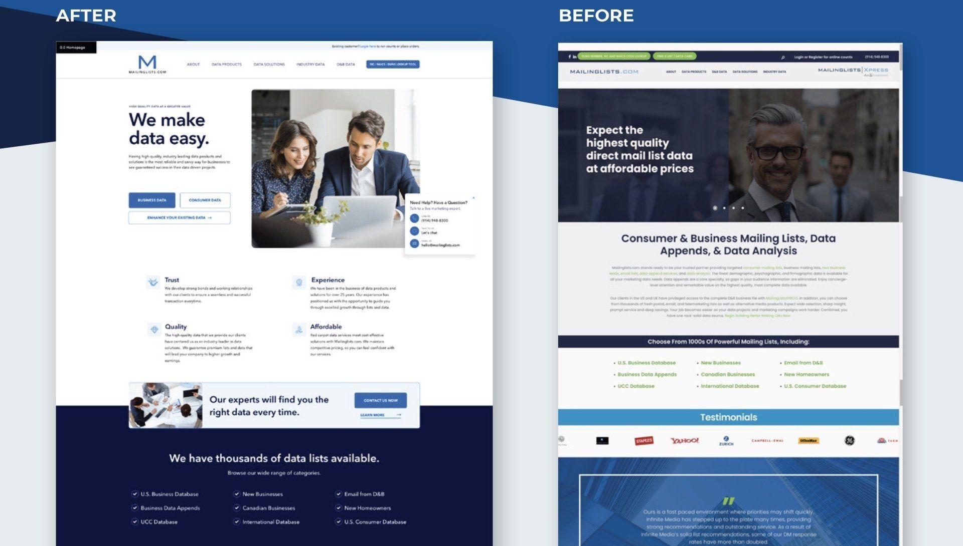
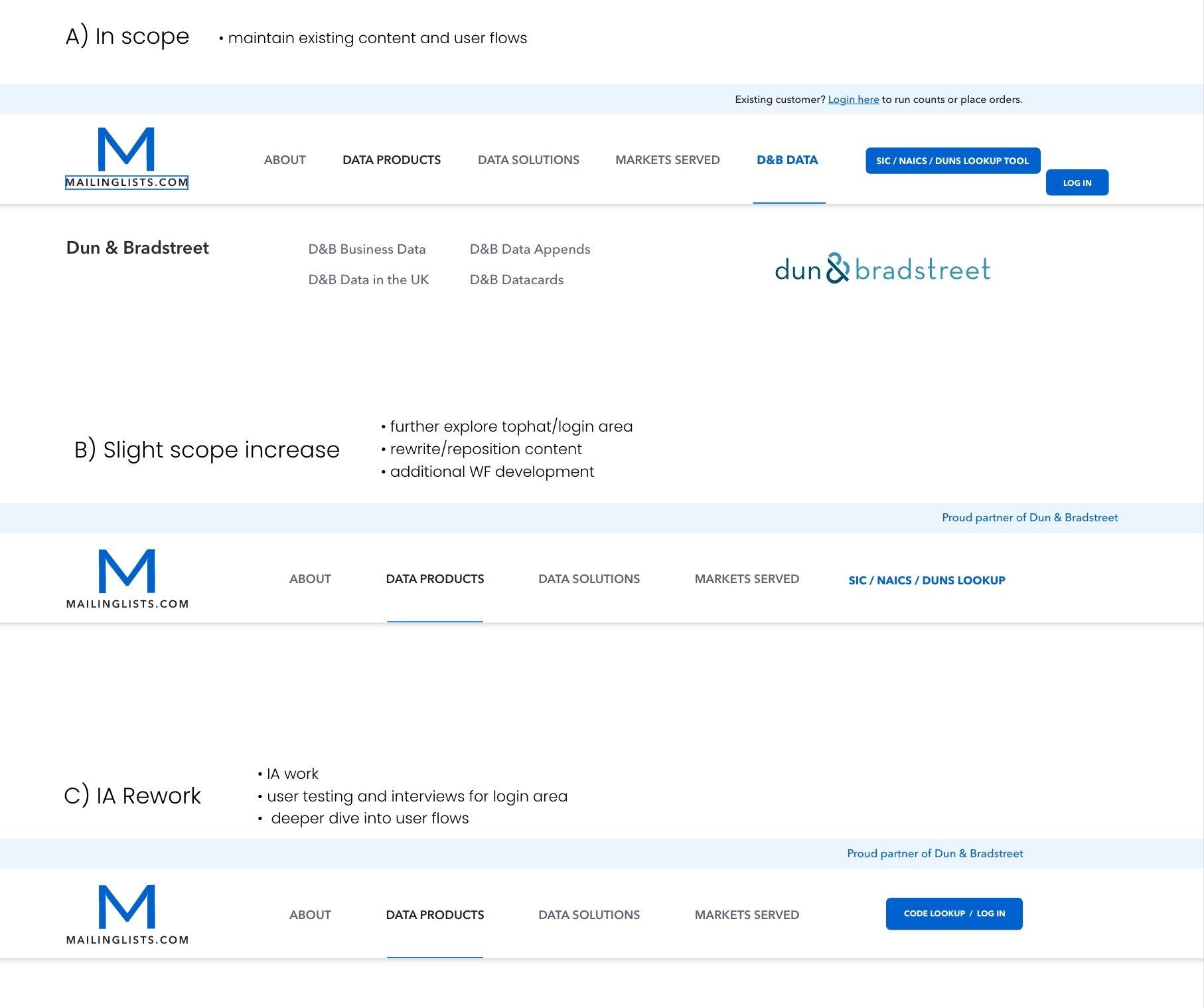
The client grew significantly in a short period of time. They neglected to pay attention to the impact on branding with their growth. They had multiple competing logos on their site with a brand explanation for each. The client themselves stumbled over explaining the brand relationships and the branding created a lot of confusion amongst users.
Process
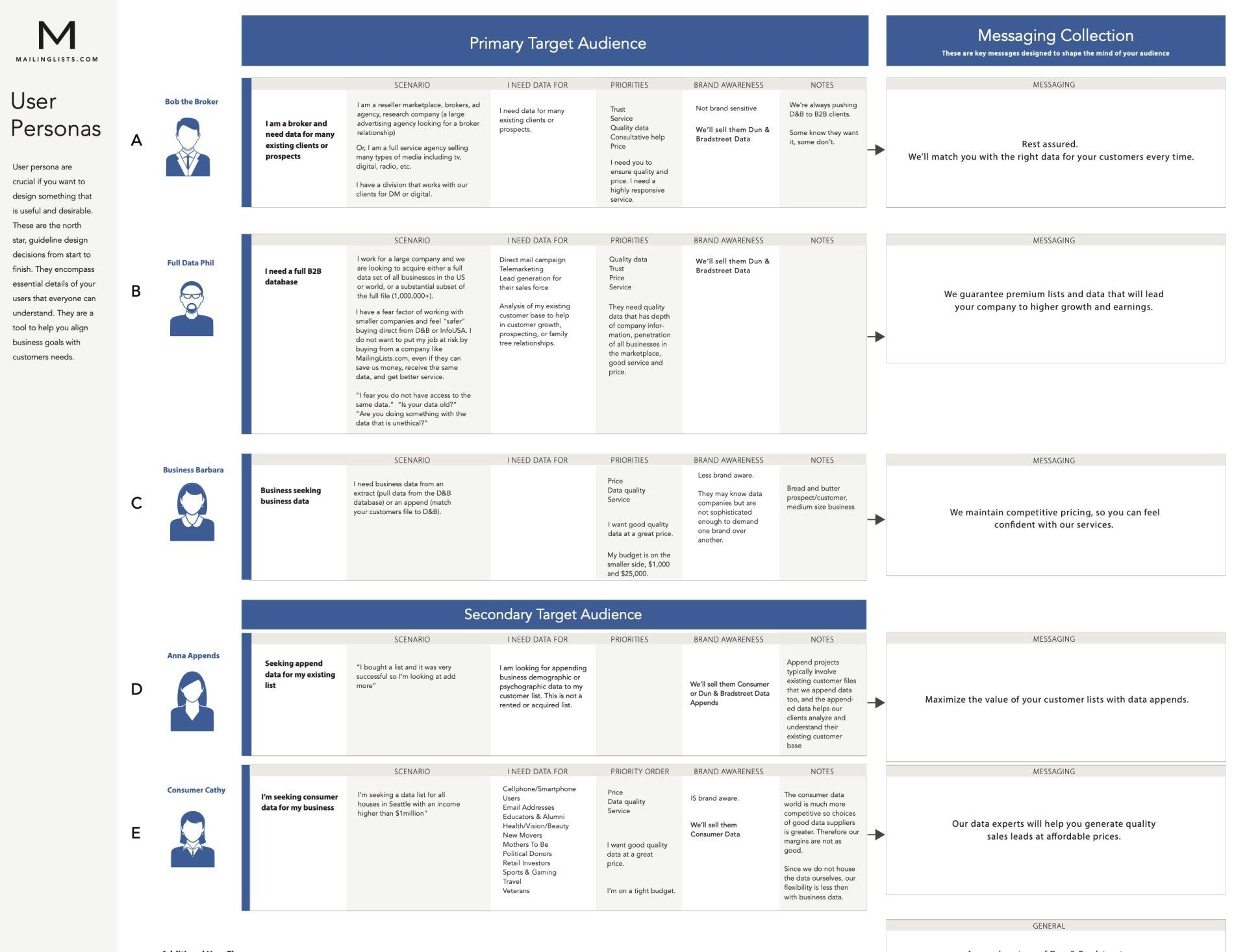
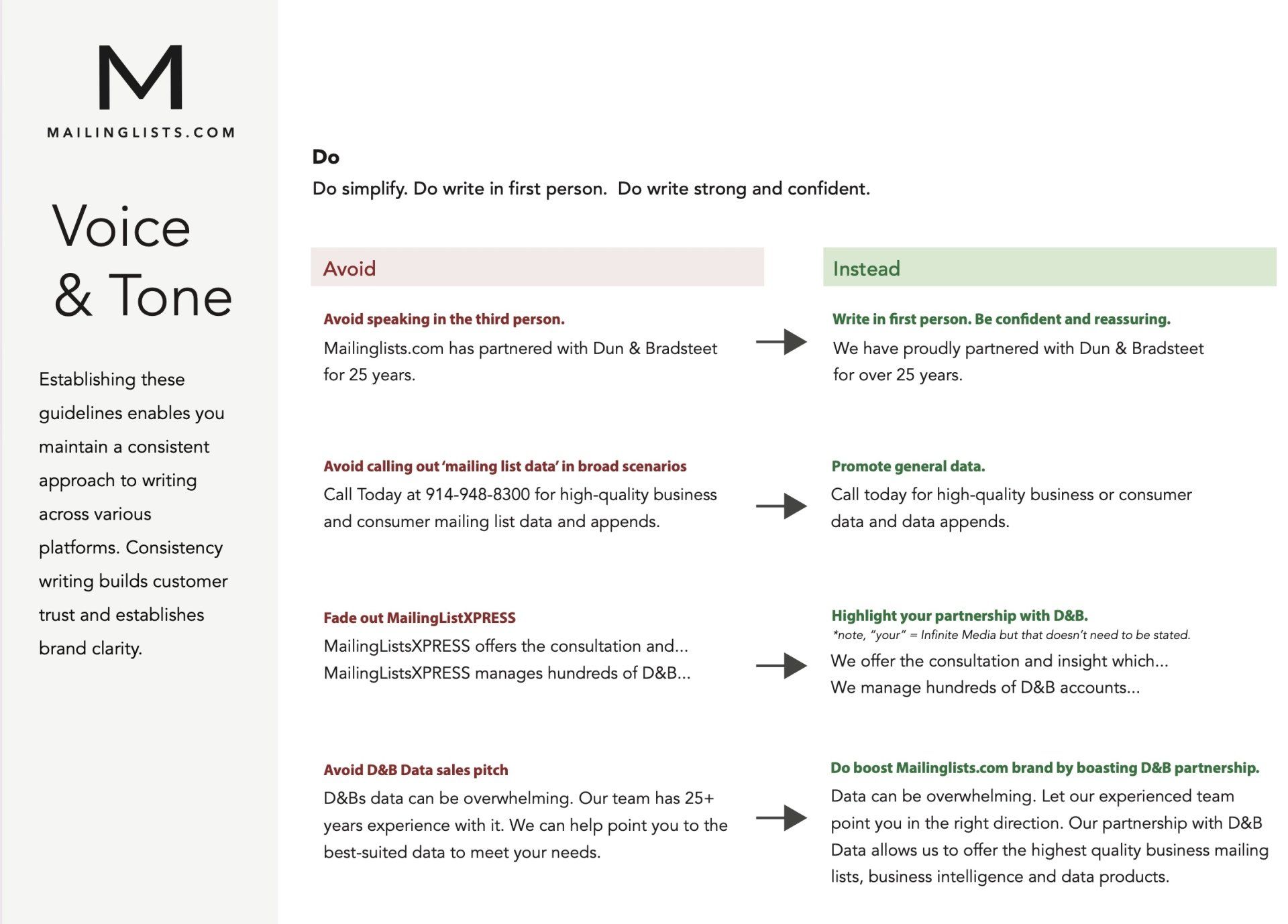
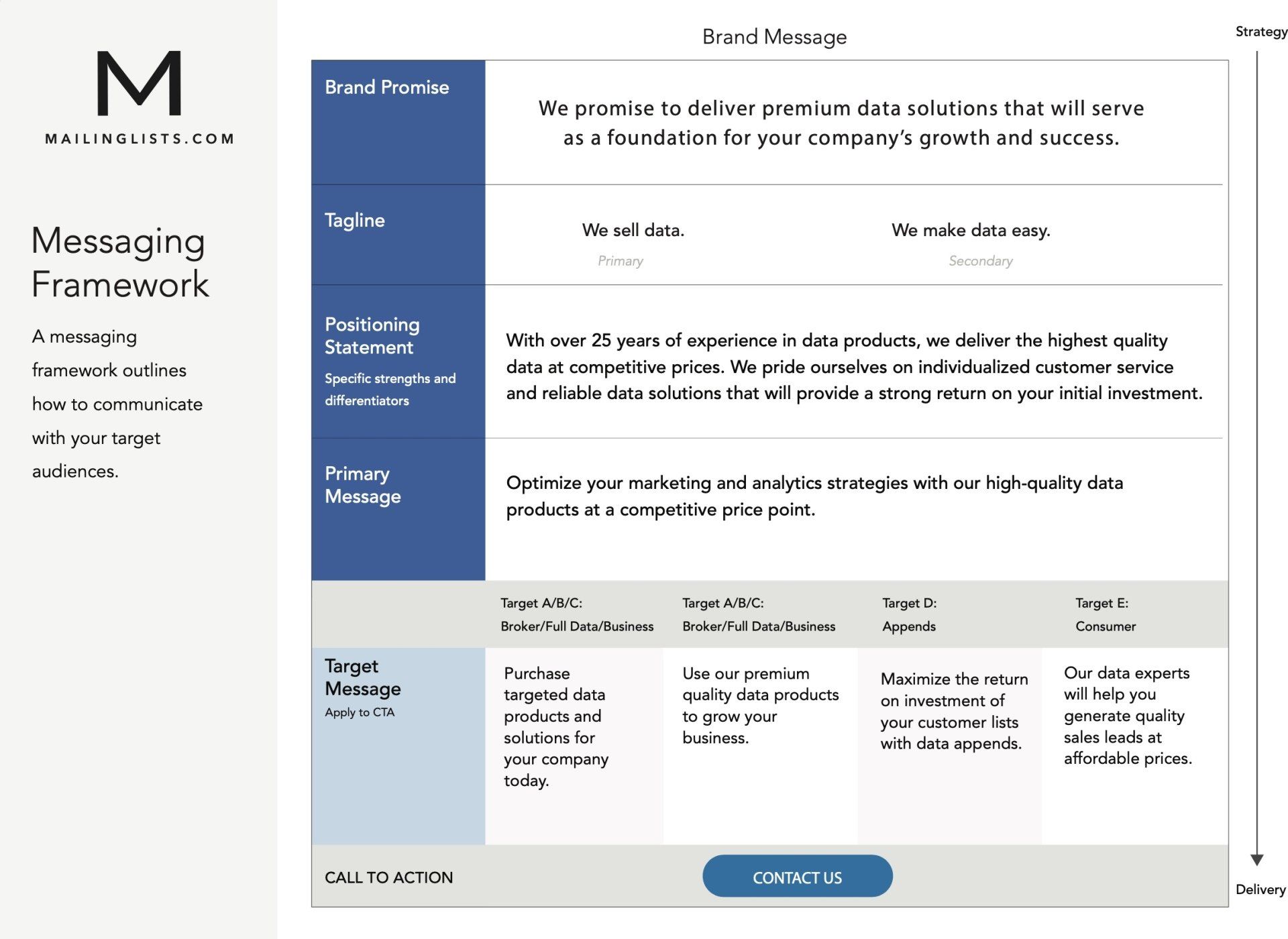
I explained the value of clear branding and through brand strategy helped guide them to a solution that provided a clear concise message and a single strong brand. To understand the full landscape and current misalignments, I spent a lot of time meeting with the business owner and his closest staff. I preformed qualitative testing through chats with the sales representatives to understand what type of mixed communications are sent to end users. By doing a thorough discovery process I was able an understanding of the business objectives and the value behind each brand. Taking each into careful consideration, I was able to persuade the client into a single brand. Specifically, we removed an old MailinglistsXPRESS logo that once was originally a part of a "quick service" portion of the brand. They also previously leaned heavily on Dun & Bradstreet brand, even pairing if with their logo since they utlize eB&D data. After much discovery, we landed on boasting the D&B brand separately on the homepage and moving away from combining it with their logo.
Solution
A new logo that embodied the key components of the once, multiple brands, into a singular mark. As a result the overall user experience was greatly improved, and a clean and clear message and appealing visual experience. There are no longer multiple competing logos on the site and the client and clearly articulate their brand message and services.
Objectives
Technical:
• Improve performance
Branding Strategy:
• Identify the brand
• Build brand awareness brand/understanding
• Convey a clear message of being trustworthy, reliable, safe with data, value oriented
• Produce clarity, confidence, alignment, and motivation (external and internal)
• Clearly deliver the message of what the business and product are
• Emotionally connect with the target prospects
• Motivate businesses and existing customers to buy data
• Create user loyalty
• Build trust
Outcome
A strong updated brand guide, clarify for users, and clear guidelines for the marketing and content teams. During discovery we also revealed the opportunity to monetize an existing feature. This resulted in a separate project. See Data Monetization (P2)
project.